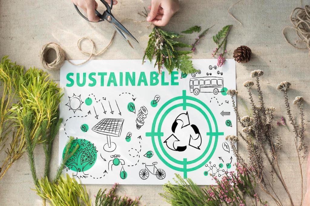
Visual Content for Green Architectures: Inspire, Inform, Activate

Today’s chosen theme: Visual Content for Green Architectures. Explore how compelling diagrams, renders, and data-driven storytelling make sustainability tangible, win hearts and approvals, and spark collective action. Subscribe to follow new visual methods and share your own examples.

Why Visual Storytelling Elevates Green Architecture

Sustainability metrics can feel abstract until a clear graphic connects numbers to daily comfort, bills, and well-being. One studio mapped winter sun paths onto a family’s morning routine, and the client immediately grasped passive gains without spreadsheets.

Why Visual Storytelling Elevates Green Architecture

Side‑by‑side visuals reveal impact faster than paragraphs. A brownfield courtyard mocked up with trees, permeable paving, and daylight reflections convinced neighbors to support bioswales, because they could literally see kids playing on a cooler, brighter surface.

Why Visual Storytelling Elevates Green Architecture

When engineers, planners, and residents view the same annotated section, jargon dissolves. A single axon with color‑coded systems resolved a month of meetings by showing how ventilation routes, plant rooms, and green roofs harmonized within tight structure.

Why Visual Storytelling Elevates Green Architecture

Lorem ipsum dolor sit amet, consectetur adipiscing elit. Ut elit tellus, luctus nec ullamcorper mattis, pulvinar dapibus leo.


Core Visual Formats for Sustainable Design

Passive strategies diagrams

Crisp arrows and shaded zones can explain cross‑ventilation, stack effect, and thermal mass in seconds. Keep labels plain, highlight sunlight and wind paths, and show seasonal variation, so people understand comfort without relying on complex simulation outputs.

Honest, high‑fidelity renders

Render daylight as it truly falls, with realistic glare control, vegetation growth stages, and material patina. Avoid over‑glossy scenes. A candid dusk render once eased concerns about bird strike by realistically showing patterned glass and interior shading practice.

Infographics that decode certifications

Translate criteria into visuals that connect to life: icons for air quality, acoustic comfort, and water reuse, arranged as an elegant journey. A circular chart showing points and benefits helps non‑experts understand why certification requirements actually matter daily.

Visualizing Performance Metrics People Care About

Use layered charts to compare baseline, design intent, and post‑occupancy data. Color the savings, not the deficits, and annotate with stories like a winter cold snap. Clear legends and monthly rhythms help everyone trust the trajectory toward net zero.

Visualizing Performance Metrics People Care About

A site plan with animated droplets tracing rainwater from roof to cistern to irrigation tells a compelling circular story. Call out filtration stages and seasonal overflow strategies, so residents recognize resilience during storms and celebrate every reused liter.

Swatches that show truth, not perfection

Photograph real samples in natural light, including color variation and wear. Pair each image with carbon intensity, sourcing distance, and maintenance notes. People trust surfaces that admit imperfections, and that honesty often aligns with durable, low‑impact choices.

Circularity on a single page

Create a life cycle poster tracing a panel from reclaimed feedstock to disassembly. Use arrows, timestamps, and small portraits of craftspeople. One renovation won a skeptical landlord by showing salvage logistics and resale value in a clear, illustrated pathway.

Comfort beyond kilowatt hours

Sketch sections that visualize radiant comfort, acoustic absorption, and glare control. Pair sensations with materials doing the work, like wood fiber panels or lime plasters. Readers connect faster when comfort outcomes accompany the aesthetics they already admire.

Community Co‑Creation: Visuals That Invite Participation

Bring oversized site diagrams with movable icons for trees, benches, and rain gardens. Participants physically place choices, then you photograph outcomes. This tactile method builds consensus faster than surveys and yields visuals people feel proud to circulate afterward.

Community Co‑Creation: Visuals That Invite Participation

Simple AR overlays of shading devices and planters on a phone can reveal microclimate changes. Elder residents once flagged glare in a corner that models missed, leading to perforated screens. Record reactions and fold them back into the next iteration.

Workflow and Tools for Reliable Visual Content

Export consistent views from your model and layer daylight, airflow, and thermal images in a shared template. Lock scales and legends. Teams build trust when every board lines up, and discrepancies become opportunities for early, productive design improvements.

Workflow and Tools for Reliable Visual Content

Use generative diagrams to explain why a chosen form balances daylight with heat. Show a family of options, then highlight the selection criteria. One page of evolutions can replace a dozen meetings and leave a transparent trail for future audits.

Publishing Strategy: Get Your Green Story Seen

Break a complex idea into a sequence: problem, strategy, impact, proof. Each slide should stand alone and also build momentum. Save one panel for a question that invites replies, turning passive viewers into active contributors to your project story.
Limitekno
Privacy Overview

This website uses cookies so that we can provide you with the best user experience possible. Cookie information is stored in your browser and performs functions such as recognising you when you return to our website and helping our team to understand which sections of the website you find most interesting and useful.